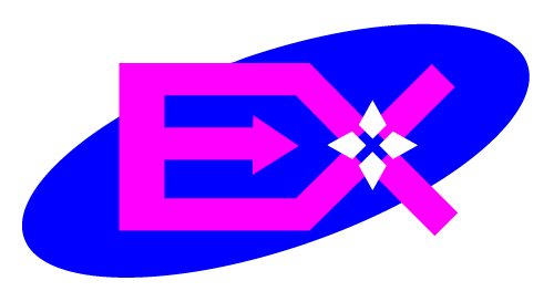
Hey, this is my design logo that I created in Adobe Illustrator, I want to talk about the process that I used in making it. The goal: create a designer logo using A.I., only two colors, and you have to make it so that it reflects you as a designer. So what I did to begin is brainstorming and sketching. Above is the sketch that I decided to use, not too much detail, only the general idea of what the logo is going to look like. After choosing that sketch, I went into A.I. and created it. That didn't look to good so I started to play around with it. First, I took off the plore part, it made the logo look sloppy and crowded, not something a customer of any sort wants. Next, I tossed around the colors, trying to get two colors that work well with each other and white (empty space). I actually got blue and green when I started to make my logo more elaborate. I decided to add empty space in the heart of the X and an ellipse behind it to pull the logo together since it looked spread out. After I did that, I pressed the wrong button and the EX turned pink. Oops. As you can see below, it looked good so all I did then was change the color of the ellipse to blue and called it good. That was the moment EX was born.