Hi guys, that jpeg is my first photoshop project! I used the text tool to get the ONW in there, but the main tool that I used was the opacity tool. I used that to make the ONW and the compass less opaque.
This is the jpeg of my second project, the butterfly. this butterfly was a monarch before I used the magic wand with a high tolerance to select and change the colors of the different patches of the wings. I also used the clone stamp to create a fluttering effect around the wings.
This project is the 3rd that I made in Photoshop. I used a text mask to create to NORTHWEST cutout of the building picture. I also used gradients to make the blue foreground a little more interesting.
This is the fourth and last project that I made in Photoshop. I used vector masks to create the foggy effect, magnetic lasso to pull off the raven head, and clone stamp to get rid of two lampposts and a few cars. You can't even tell they where there!
After using both Photoshop and Illustrator, I can tell why Graphic Designers need both. Each program has it's own strengths ad weaknesses, there are some parts that the other can't even do, and by using both of them Graphic Designers have an arsenal of tools that create almost anything.
E-Communication
Tuesday, December 16, 2014
Monday, December 15, 2014
Websites
So, these screenshots are of my first two websites that I created in Dreamweaver. Even though most of the project was easy, there were a few hard parts. The hardest part was adding in the video and animations. I didn't understand some of the instructions and carrying them out was even harder since I didn't know some of the terms.
Friday, November 21, 2014
Design Logo
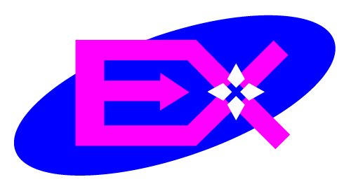
Hey, this is my design logo that I created in Adobe Illustrator, I want to talk about the process that I used in making it. The goal: create a designer logo using A.I., only two colors, and you have to make it so that it reflects you as a designer. So what I did to begin is brainstorming and sketching. Above is the sketch that I decided to use, not too much detail, only the general idea of what the logo is going to look like. After choosing that sketch, I went into A.I. and created it. That didn't look to good so I started to play around with it. First, I took off the plore part, it made the logo look sloppy and crowded, not something a customer of any sort wants. Next, I tossed around the colors, trying to get two colors that work well with each other and white (empty space). I actually got blue and green when I started to make my logo more elaborate. I decided to add empty space in the heart of the X and an ellipse behind it to pull the logo together since it looked spread out. After I did that, I pressed the wrong button and the EX turned pink. Oops. As you can see below, it looked good so all I did then was change the color of the ellipse to blue and called it good. That was the moment EX was born.

Friday, October 31, 2014
Color Wheel
 |
| Adobe Illustrator Color Wheel |
Orange is the color of social communication and optimism. From a negative color meaning it is also a sign of pessimism and superficiality.
With the meaning of colors, in color psychology, yellow is the color of the mind and the intellect. It is optimistic and cheerful. However it can also suggest impatience, criticism and cowardice.
Green is the color of balance and growth. It can mean both self-reliance as a positive and possessiveness as a negative, among many other meanings.
Blue is the color of trust and peace. It can suggest loyalty and integrity as well as conservatism and frigidity.
Indigo is the color of intuition. In the meaning of colors it can mean idealism and structure as well as ritualistic and addictive.
Purple is the color of the imagination. It can be creative and individual or immature and impractical.
The color meaning of turquoise is communication and clarity of mind. It can also be impractical and idealistic.
The color psychology of pink is unconditional love and nurturing. Pink can also be immature, silly and girlish.
In the meaning of colors, magenta is a color of universal harmony and emotional balance. It is spiritual yet practical, encouraging common sense and a balanced outlook on life.
The color brown is a friendly yet serious, down-to-earth color that relates to security, protection, comfort and material wealth.
From a color psychology perspective,gray is the color of compromise - being neither black nor white, it is the transition between two non-colors. It is unemotional and detached and can be indecisive.
Silver has a feminine energy; it is related to the moon and the ebb and flow of the tides - it is fluid, emotional, sensitive and mysterious.
Gold is the color of success, achievement and triumph. Associated with abundance and prosperity, luxury and quality, prestige and sophistication, value and elegance, the color psychology of gold implies affluence, material wealth and extravagance.
White is color at its most complete and pure, the color of perfection. The color meaning of white is purity, innocence, wholeness and completion.
Black is the color of the hidden, the secretive and the unknown, creating an air of mystery. It keeps things bottled up inside, hidden from the world.
Friday, October 24, 2014
Color Schemes
Hey this is Ethan and i've been learning about logos and the colors put into them. If you don't know what I mean, this is a great example.
This is the Tostitos logo, Tostitos is a tortilla chip company and their logo shows creativity and planning. The use of warm colors (red/orange/yellow) helps me think of food and the warmth of the salsa i'm about to eat with these chips. If you look closely, you can see two people sharing chips and salsa. The two Ts make the figures while tine yellow triangle between them is a chip and the red tittle of the I s the bowl of salsa. I think that by using these colors and the hidden picture, the Tostitos logo can easily draw your eye to it and keep you looking. I aupplaud your cleverness, Tostitos.
Thursday, October 9, 2014
I want to share my experience as a student in E-comm. I have only had a quarter of a school year to study Video in E-Comm, but I defiantly think I have learned a lot. When I started school and I learned I was staring in Video, I was disappointed. I was planning to drop Video as soon as freshman year was over. Now that I have actually experienced the Video, I think that I am starting to enjoy it.
I have learned so much, editing, filming, acting, story boarding, short cut keys and so many other helpful things, I can't list them all! If you are reading this and are thinking about joining E-Comm, I only have 2 more words for you. Do it. I know you will enjoy it as much, maybe more, than I did.
Tuesday, September 30, 2014
As I mentioned earlier, the entire collaboration idea is so different then before! We still worked together, but I had a completely different role in the planning/filming than on the last two projects. The only thing I think my group could have done better was the story boarding, the story boarder didn't even know what they were support to do! I think we need a little clarification next time.
I also learned some shortcut keys that will help me with my next project, some of the keys are j, k and l. These keys make rewinding, stoping and fast forwarding so much easier than going frame by frame.
Subscribe to:
Posts (Atom)


